Location science for healthcare.
Incorporating geospatial technology, healthcare market data and real estate data into actionable insights for healthcare strategists.

Overview
In response to feedback and research on our initial version of our SaaS platform, our team realized that in order rectify customer pain points and respond to growing business and technical needs, we needed to redesign the experience. This was sort of expected, as we tried to build the initial version as quickly and simply as possible in order to learn more
With usage analytics and customer feedback, we learned that:
Although they had reported the need to customize their journey at each step, in reality, users felt too bound to the order of the sequence and just wanted to get to an output quickly. In some cases, users would still be interested in making some tweaks to filters, but that did not need to stop them from seeing the full picture first.
Our assumption of users needing to customize each step of the process was over inflated for the majority of users.
The culmination of multiple tasks is where they were always headed – meaning, it did not have value until all tasks were completed.
They used and still wanted to continue to compare market that were created.
Build in default sets of filters that could later be customized.
Get the user to the final "result" in less steps. Ensure the user could easily export the map view plus Insights to use in presentations.
Add additional insights about the market in addition to the map view.
Allow users to easily compare markets and select which ones may be most profitable.
Allow users to edit markets.
Provide access to details about locations.
Update our technology - build the new application as a decoupled microservices app, to help with scaling and high rendering needs.
Create a way for administrators of organizations to manage users and grow adoption.
Allow users to easily compare markets and select which ones may be most profitable.
Apply new branding.
Challenges
Deciding how much user input is necessary before we render useful results
We considered a simple up-front option for pathways to select from: "Quick Insights" (less up front input) and "Market Explorer" (more user input up front). The idea was rejected due to need to build two separate experiences in V1 would take nearly double the time to get concept out there.
How to present geospatial information alongside market insights
We considered a split view with default map only (user initiated)
Considerations about how much information should be displayed for quick insights, and still provide user with detailed data when needed
Learnings from performance and loading taught us that (especially the composite with all insights at once) the map view is a heavy load in the browser, let alone additional graphs or charts.
The nature of geospatial analysis presented the need to consider how to allow users to select a geographic region by 3 different (familiar and often used) methods to create a market.
By Travel Time around a specified point of interest
By a list of ZIP codes, which our healthcare system personas had in their existing workflows
Later this grew into a way to visually select ZIP codes on the map based on data findings. For example, a user could see a high population growth / density area and add those ZIP codes to their existing market to re-render the market insights.
Draw an area on the map
We considered dropping the user directly onto the map, using user's current location as a starting point. Sort of a "wayfinding" method based on map insights
cut due to: Inefficient performance and unnecessary data loading
How to allow the user to compare multiple markets for market selection
The original design used a tabbed approach, where users could easily switch between to compare insights against one another. We wanted to replicate this somehow within the new experience.
Redesign
The initial experience we had launched was based on a sequence of tasks, where users could set and layer information onto the map as the user needed it; ultimately arriving at a composite on a map with insights they could use in presenting opportunities to their customers.
Objectives
Wireframes

Quick Start

Quick Insights Options

Define Market

Define Market by Travel Time

Results Page with Defaults

Results with additional insights
High Fidelity

New branding meant a new design system in Figma

Define Market Options

User Interface Elements
Results Page
Validation of Design Ideas
Customer Interviews
During the wireframe phase, during the mockup phase, and following the initial version we launched, we conducted customer feedback interviews.
Heap Analytics
We tracked how many users changed the default filters upon initial load. Our hypothesis here was based on a previous iteration; that many users did not want to take the time to select a set of filters that were frequently used out of all of the possible service lines and location types.
Customer Service Team
Customer Service team - while servicing, what were frequent pain points that users maybe were not articulating or we weren't thinking to ask?
Results
|
Objective
|
Results
|
|---|---|
Build in default sets of filters that could later be customized. |
This helped users get started quickly. However, we did track that many (about half) users still made changes to the default filters. This led us to explore how we might better serve customers with an experience that saved their filters as preferences; preserving the ability to quick-start any project.
|
Get the user to the final "result" in less steps. Ensure the user could easily export the map view plus Insights to use in presentations. |
The new experience reduced the amount of steps to get to results from 10 to 3, but users who still wanted to customize filters required a few more in between.
|
Add additional insights about the market in addition to the map view. |
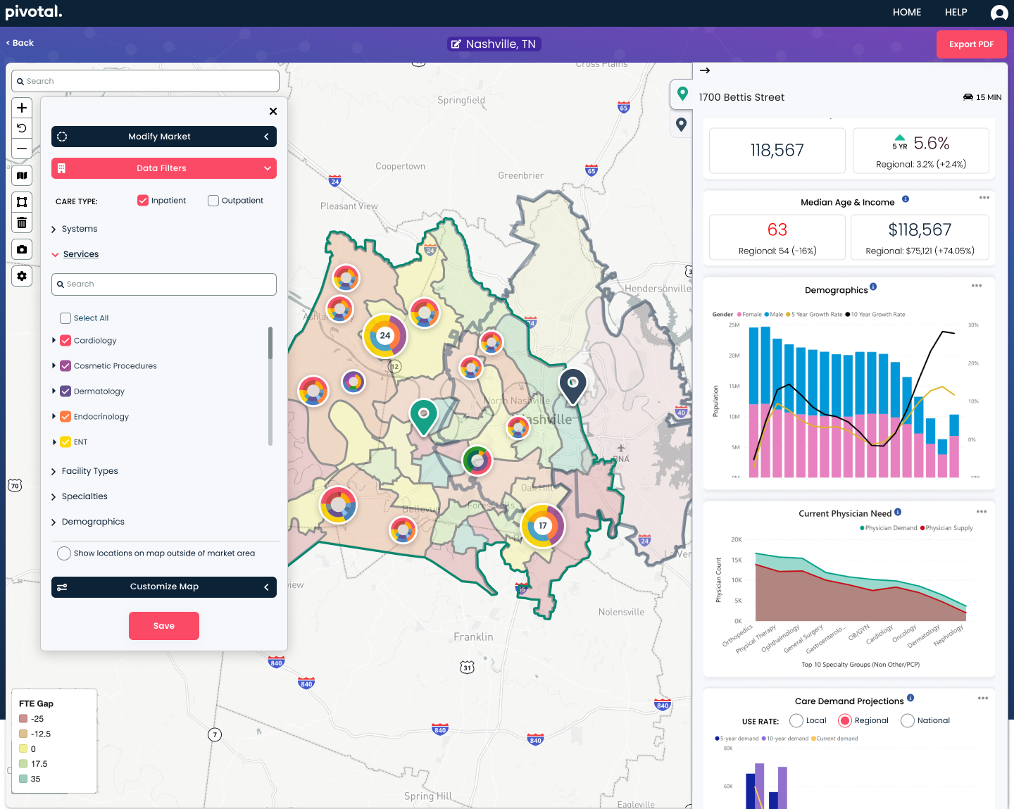
The new results view featured top insights about the defined market summarized along the sidebar. This made it easy to compare markets. After the initial iteration, it was obvious that users still wanted a more detailed look of certain insights, which we provided as a download.
|
Allow users to easily compare markets and select which ones may be most profitable. |
We kept the concept of tabs that were useful in the initial version. We utilized the sidebar of insights as the indicator which market was in focus at a given time. The map helped to keep a view of other markets in context.
We also provided a simple way to download the map view for use in presentations. Users were thrilled with this simple addition.
|
Allow users to edit markets |
Users could edit markets they had already created in the setup step. This helped them to adjust their catchment area based on results and insights on the map. This saved them from having to create a brand new project like they did in the initial version, and from us having to host all of those projects indefinitely.
|
Provide access to details about locations |
Users could now interact with a location marker on the map which corresponded to insights in the sidebar. This gave the user a quick idea of what services where provided where, plus the ability to drill down into a specific location for the volumes and revenue.
|
Update our technology - build the new application as a decoupled microservices app, to help with scaling and high rendering needs |
The new app was faster and gave us the ability to expand on delivering features within the complex presentation of geographic data and maps together.
|
Create a way for administrators of organizations to manage users and grow adoption. |
This allowed organizations to invite others within their teams, which cut down on barriers to adoption as our previous version required our team to manually invite individual users.
|
Apply new branding |
After our consultant provided all of the specifications of our new brand, I created a new design system based on it, which was applied across our entire application.
|