Learn the difference between a font choice and customization versus the hand lettering technique for logo design, and how to make sure you get the right touch for your brand.
The Difference
Typeface Systems (Fonts)
Typeface system based logos use fonts that are crafted, designed and made into a file for reuse, available for licensing online from reputable font foundries and distributors. There are also many discount sites where you can download high and low quality fonts, where the licensing is listed per font. A good designer will:
- Know where to find high quality fonts (or own a license to use chosen typeface already)
- Understand licensing and how to provide you with all of the ways they will need to provide you with your logo and brand pieces so that you are able to use them with ease and without legal worry. This includes knowing where to draw the line in customizing the letters enough as not to infringe upon copyright as outlined in the font license agreement
- Customize the look of your logo starting out with a typeface chosen for the project that will give you a recognizable look and meet your goals for your brand.
Many times you can find examples of fonts (high or low quality) not being customized with low value design work. This will not set you apart, nor will it add to your brand’s (positive) reputation. Not only that, but it is illegal from a copyright standpoint in many font licenses. Reputation is something that must be built from the beginning of interaction with a brand - whether it’s their logo or an experience - like trust. That is another post about branding in and of itself, but it’s necessary to touch on when relating to branding techniques and their results.
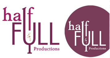
Good design using a typeface begins with a quality font chosen by designer who then customizes with a trained eye and sometimes adds to the name with a mark (image, letter) of some kind. This can be done very image-heavy or very text-heavy, creatively incorporating a mark or the type into shapes to represent your service or products. This will set you apart and become recognizable with your reputation.
Hand Lettering or Custom Logo
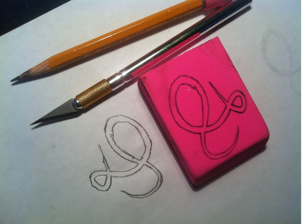
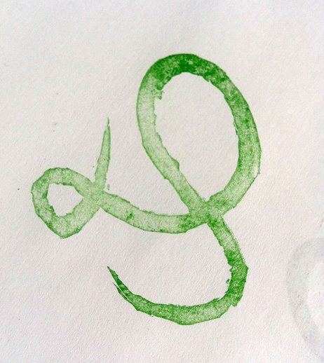
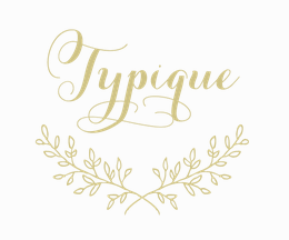
This technique is used to provide a completely, one-of-a-kind logo or lettered graphic. This could be derived from a style of a typeface (or a couple) that works well for the project goals, or it could be drawn specifically creatively/unique per letter. This method allows a hand crafted look that will set you apart just by the nature of the custom technique itself. Some projects call for a hand drawn look (nothing else would make sense) and some can simply benefit from it. In a digital world where many logos look the same due to the nature of font usage, it’s smart to consider the value in this technique.
While hand lettering has been around for a very very long time, the craft has been modernized with the use of technology late in the process to simultaneously provide what is needed for use of a logo in a modern world.
A good designer will help you decide which type of logo may be best for your project. No matter what technique is chosen, simple is always best.