While working on the product design team for Schoolwires Centricity Application (which later became a Blackboard product), one of the key personas we often designed for were many types of school district personnel, and the consumers of their communication; their community.
Parent Focused
After becoming paired with another mobile app service through our acquisition, our K12 product team was tasked with designing a new feature that could display data from multiple systems to our customer’s end users. The mobile app service was to deliver some brand new data points to our users, and had a different design all together.
The data was to be accessible at all times the user was logged in, and customized to their school and student preferences. It was to incorporate our existing data and expectations with the new service in a easily accessible experience. The mobile app service’s users were also to be using this new application and gain more value from their existing partnership. We had to figure out how to prompt new users, along with easy set up and communicating value.
Wireframes, Prototyping and User Feedback

Around the time we started this project, we were given a design language to start to incorporate. This allowed us the opportunity for a new experience which was visually separated from our existing admin view or end user experience. We designed and tested a sort of a hybrid of the two; accessible from end user district website, but without compromising the website content or brand.
During testing of our ideas, our team took notes from a few rounds of customer prototype feedback. Read more on how they were organized to be actionable here: Organizing User Research.

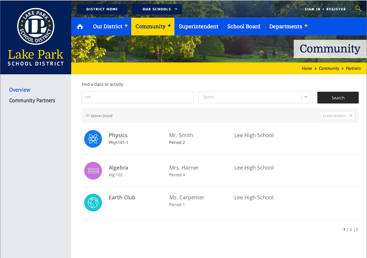
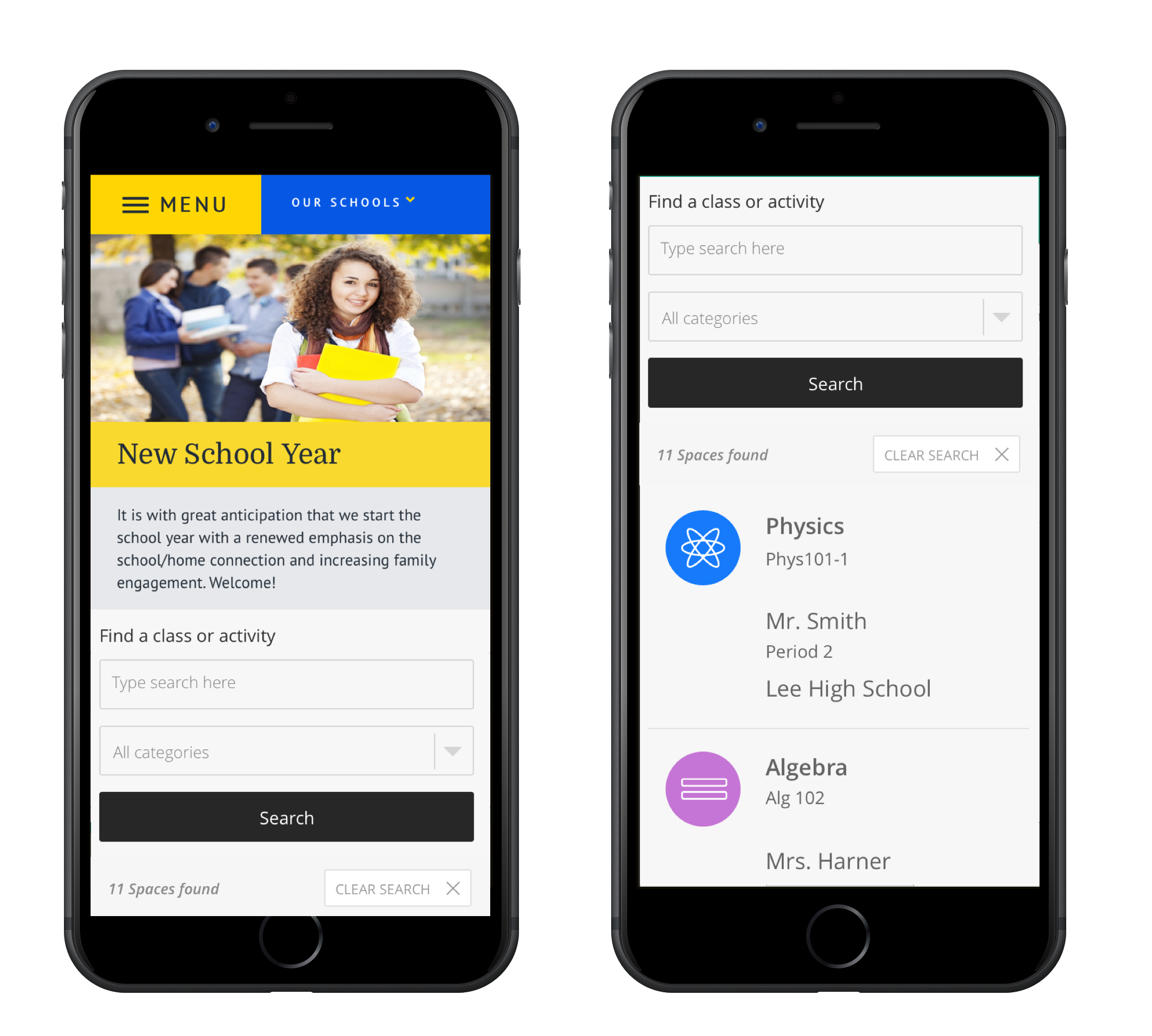
Sidebar UI
For business and UX considerations, we decided to keep our current Start Bar in the top of our websites, and introduce something brand new which was for a totally different use case than providing navigation and access. We explored options that are planned for post-MVP, such as user-docking and preferences. As our client's websites are highly varied in design, to launch we decided on a sidebar because it wouldn't conflict with existing navigation and could be implemented with minimal disruption of content and brand. We worked closely with our Creative Services team to ensure that even the most customized templates wouldn't be effected, or at least had a plan for addressing. This was an especially tricky consideration with regard to our responsive website strategy.
Updates from School
No more would a parent have to search through multiple pages on a website to get the updates they needed for their students. The introduction of a calendar view, shortcut to other services, and groups they were already associated with would now be accessible from the school website in one, personalized space.

Wireframes by Heather Boyer and Kelly Reese. Rights Blackboard 2013+. Definition of admin settings on stream and subscriptions.
We implemented a main stream of all updates from subscribed schools to provide an aggregated view for quick and easy consumption of content. This was formatted to visually feel holistic, while pulling data from multiple backend systems. The stream indicated which type of content was being displayed, as well as which school it was from. Each update had a detail view for more information.
Eventually, we would add student profile information for more detail on a particular student's activity. This included many new data points from systems they were associated with such as Library Books, Cafeteria Account Balance, Bus Routes, etc.

The main stream of updates in user dashboard was the first navigational item in the sidebar, and default view for opening the sidebar without recent history to reopen. Rights Blackboard 2013+
An example of an update that would display in the feed was a calendar event. We simplified the view for consistency within the new experience. A user would see a new event was added, and could open to see context around other events. There were also some small hover events that provided more details in the feed view, such as specific posting time and date.

Calendar stream update

More detail into calendar event and other upcoming notifications in that calendar.
Student Information

Student Profile Summary

Student Profile Detail View - Attendance

In the Assignments view, I used a combination of color and separate metaphors to correlate with status for each assignment's state. This helps with accessibility because users can see a difference in status without solely relying on color, making scanning easier for those who can see both as well.

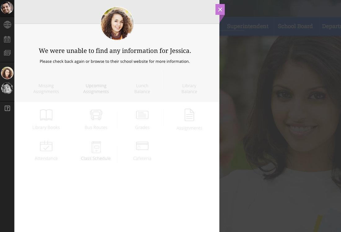
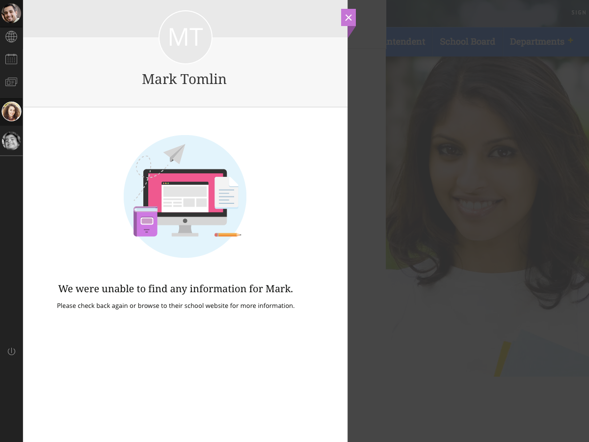
Blank State
Two Blank State options before a user had data integrated. This would help users to know they were paired with the correct student, even if data was not working or syncing for any reason.
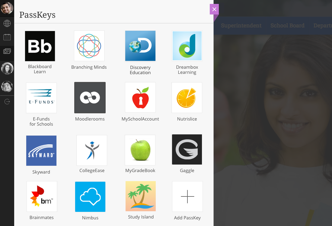
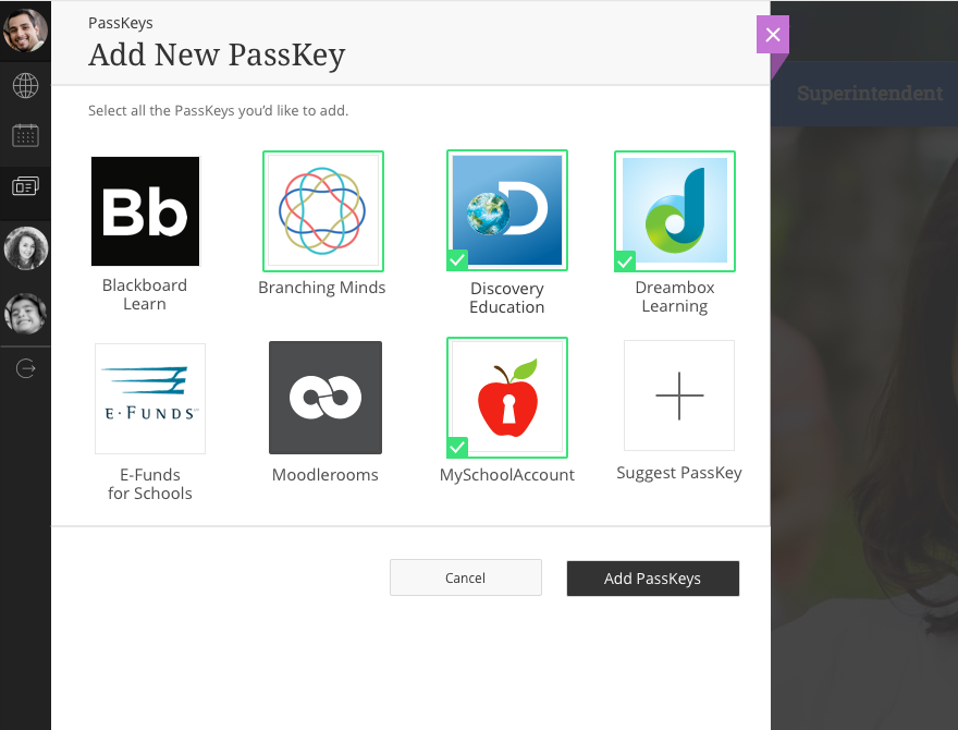
Third Party Shortcuts
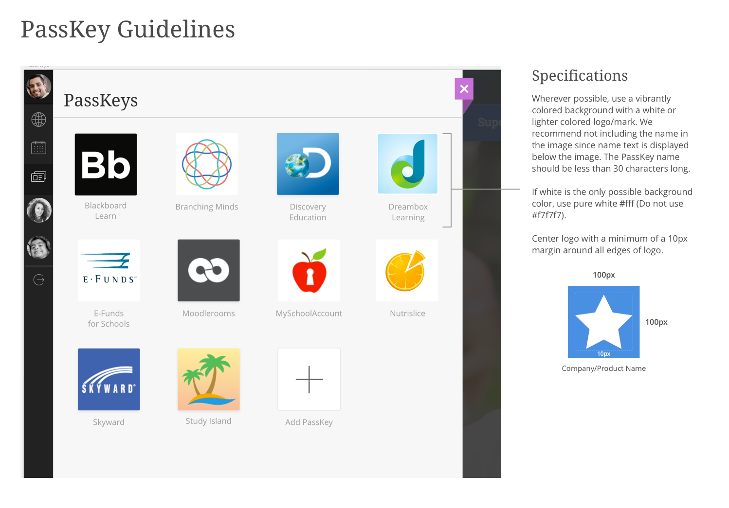
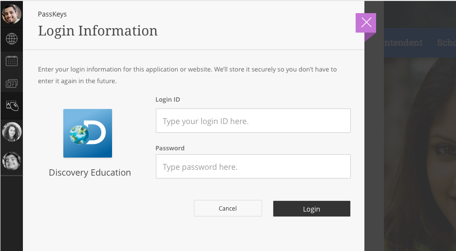
Outside of the data sources we pulled data into views for, we updated a feature from our legacy user area that allowed third party single sign-on for often-accessed links into other systems (for example, grading systems) that our product did not focus on. We redesigned the experience to make sense inside our new dashboard, and also redesigned the guide we could provide clients to creating their own custom “passkeys”.
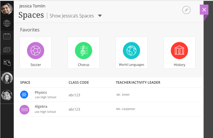
Spaces
Another area we offered to our users inside our current system was called Spaces. It was a place to migrate clients to that already had a set of features to manage data like this, and also a great place for groups to collaborate online. These groups were sometimes school related, but could also be clubs and extra curricular, student or parents organizations, etc. We tested the value of this data being served up in this new space, and it was well-received. The future of this feature would include updates in the main stream, as well as activity postings in this area.
The spaces all had choices from a huge library of custom avatars, which I designed with a palette of color options.
UI Considerations
As previously mentioned, this was our first full feature to begin incorporating the new design language Blackboard broad onboard. This presented many challenges considering that the effort to design our legacy system would take a long time to complete. The application of the language was always being updated, but had a fresh look from our old system. This didn't mean we could completely deviate in some areas and terminology, so we did our best to look new while keeping barriers to adoption low as possible.
The difference in design language from our current admin system to the new reface we were working on. The revamping of our Design System was another project that I lead. More to come on that soon!

Explorations of Loading UI/Animations for the Main Stream.
We dedicated a sprint of to interface enhancements with a series of interactive feedback and animations. Some samples of the communication of these changes are below.
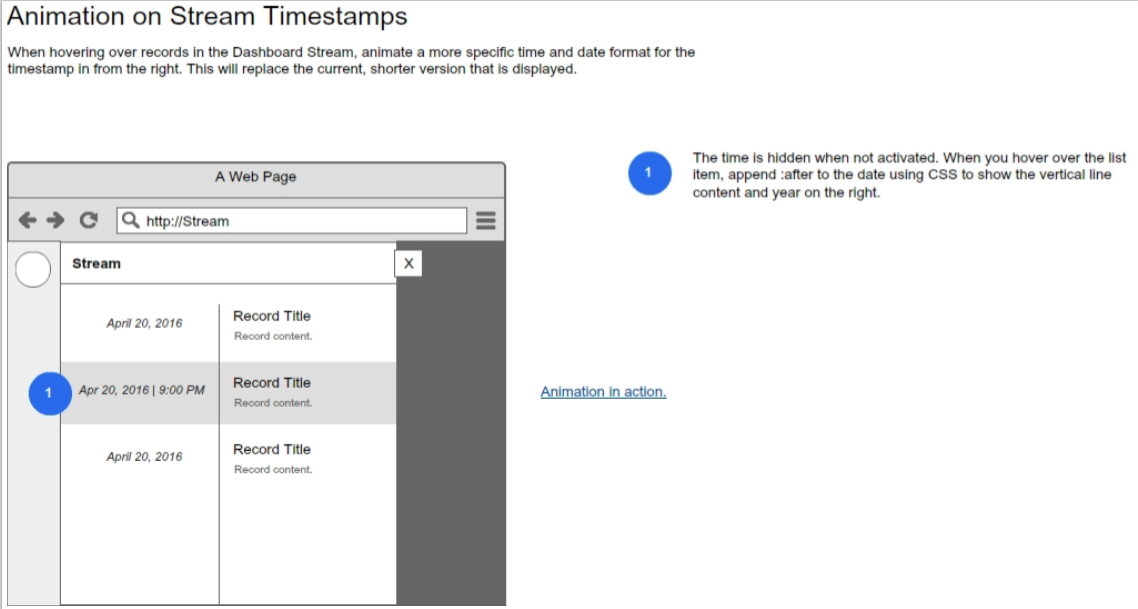
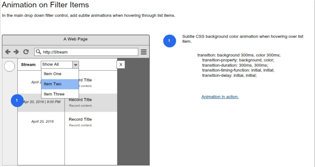
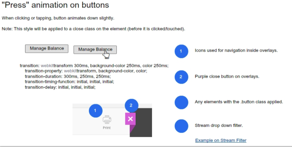
I only use Hi Fi prototyping when necessary for examples, but intent is communicated through annotated wireframes to keep focus on function. Sometimes, examples, component names and/or style and animation code is included as needed.
Mobile considerations
Some of the principles that were used for visual constancy within the feed were taken from a previous project, when I redesigned our mobile app.

Accessibility – 508 Compliance
This feature is slated to receive some color contrast updates to adhere to 508 accessibility standards. The design language already contained a lot of contrast, so only a few stories needed to be added to the roadmap to complete this compliance. We performed navigation tests with accessibility in mind throughout the design process, and this feature performs pretty well using keyboard and screen reader technologies. There are improvements to be made for audio responsive technologies in addition to navigation as more tests are run.