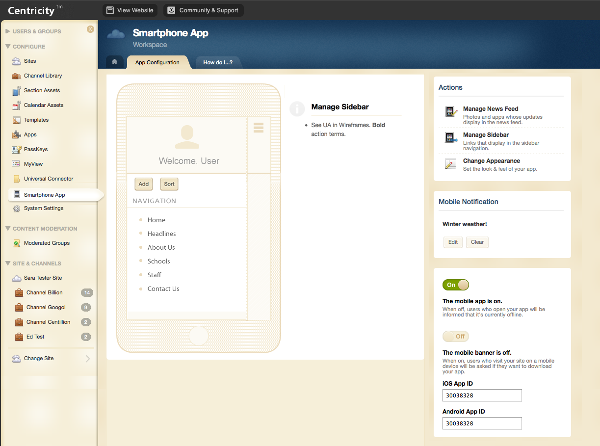
Mobile Configuration UI Collaboration
When our company released our mobile app for school districts to distribute content, we knew the admin side of our CMS (where they were already familiar with using to author and edit) was the perfect place for the workflow to guide them through to configure the app.
These are the wireframes designed by another of our awesome UX designers Kelly Reese (@kellyereese), paired with the resulting UI design for each screen.
Working alongside Kelly, the wireframes were defined and handed off to me for UI design in this project. You can see that we wanted to convey that the configuration would affect an external system, and help the user focus on the content while staying within the environment of the CMS they were working in.
We also balanced those requirements with giving them enough of a preview without leaving the space.


