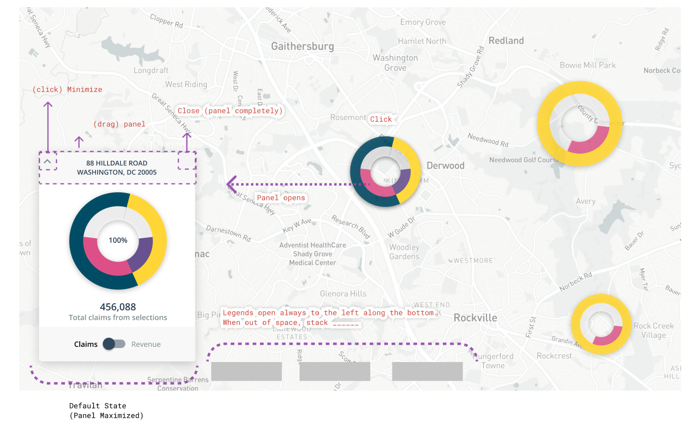
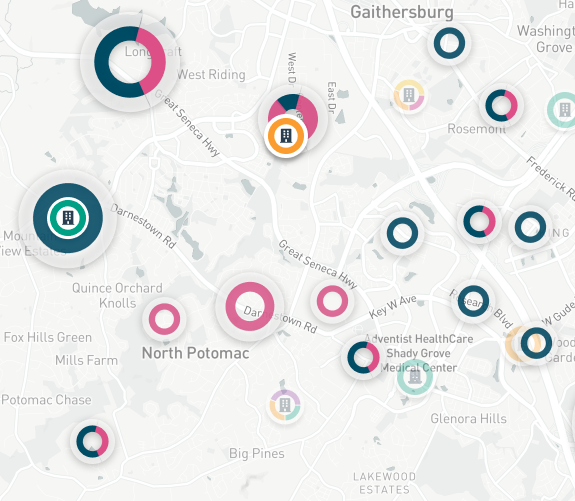
Multi-Level Geospatial Data Visualization
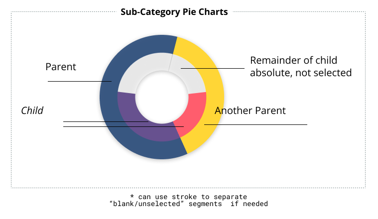
Snapshot of my Figma frame displaying the explanation for implementation.
Designed using Figma.
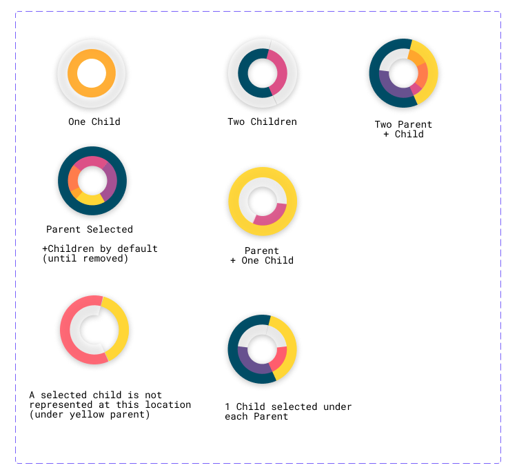
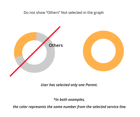
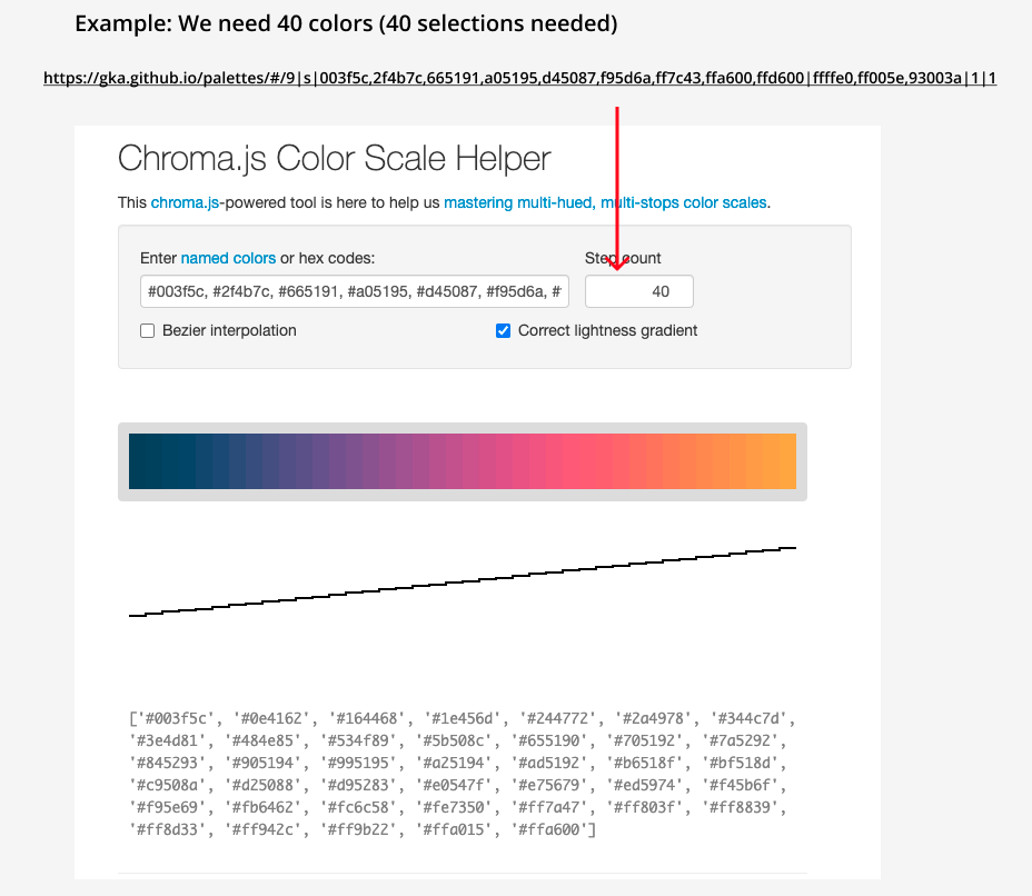
Using chroma.js - based color palette helper, defining the order and logic in which colors will assign to our map markers which show the distribution of parent/child categories within location markers on a map. The selections and combinations were unpredictable, so that was a consideration when the decision was made to pull colors within the range from opposite ends for every color that was assigned.
Additional considerations include:
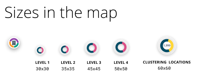
Context of other data layers & markers which can be present on the map at the same time – in any user-defined order.
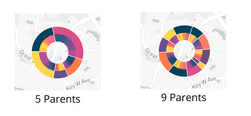
The nuances of the dataset behind this visualization (such as the density within certain zoom levels on the map, how often we want them to “cluster”, and how to present and interact with details on any segment within these graphs - both absolute numbers as well as a switch to view by revenue).
Ultimately, our guiding light was how our users can use the data to answer the questions that they can not yet answer with any other tool in the market in this way. We often stepped back to this question to ensure we didn’t get stuck with details that didn’t matter.