Last week, I outlined the process I used to produce my UX workshop for a live event earlier this month. This week, I’m diving a bit deeper into the activity we did as a team of workshop participants.
As I mentioned previously, it took me some time to settle on the right kind of activity for this workshop for a variety of reasons. To read more about how I arrived at this idea, read last week’s post.
After figuring out a more adaptable example, I decided to find and solve a problem myself and pretend that research and validation methods had already been applied. We would then bridge the gap just before design took place by collaboratively prioritizing features using a very simple Red Route technique that I found on http://uxchecklist.github.io/. This proved to be effective toward my workshop goals and easy to collaborate on.
This activity also tied in nicely with the real life example I walked through of how Disney researched to come with their MagicBand technology. It illustrated focus on research and vision first, with use of technology to facilitate a solution. It also helped to drive home the goal of UX going beyond technology.
Here is the real life example project I used to teach user experience.
The Bad Experience
The problem I decided to solve for our example was the experience of changing an address. I felt it was relatable enough with most people and would still work within our session scope.
First, I wrote a simple, bulleted list of all of the steps and emotions involved in the change of address experience today.
Current Steps in Experience
- Google How to Change Your Address
- Read suggestions
- Make your own list based on services you use by name
- Contact each one in a different way
- Many are paper based
- Hope you got them all
- Wonder if your old neighbor is getting your mail, or if your W2 is late because they have the old address on file.
Next, I wrote a basic list of problems to solve, including emotional needs.
Problems to Solve
- Time consuming
- Worry that you got them all
- Privacy concerns
- Credit concerns (paying bills late, etc)
- I’m never moving again (LIES)
- Room for participants to suggest more
From here I made a simple flow chart to start a general discussion around what a solution might look like. This also helped feature ideas pop out to me as I put myself in the user’s shoes.
Flowchart I made in Lucidchart to visualize my thinking.
Feature Ideas
- Sign in / Registration
- Service Sync: Finding services you used based on the names of the apps on your phone
- Service Input Options (similar to mint.com manual add)
- Social Media authorization
- PayPal integration for additional notification services (sending a postcard to your contacts, etc.)
- Sync with email - help find things you signed up for and prompt you to add them to your services list.
- Paid upgrade for frequent changes
Workshop Activity
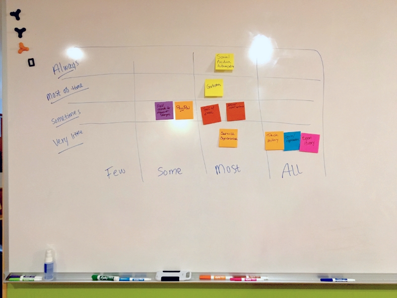
When we all gathered near the whiteboard for the activity, I drew this chart to match the example. I read through the list of features out loud and had a variety of participants write out each one on separate sticky notes. After they were all written, I had people read each one out loud and we discussed what it might mean in context of the chart and placed it. A few were changed as we tried to remember the most general context and pretend some research had been done.
Photo by Erin Good, of the activity on the whiteboard.
Additional Ideas to Test
While we collaborated, a few points were brought up about context. Because this app would be maintained over time but not used to actually change your address often, we had to continually remind ourselves that the frequency of use was overall; when the app is being used. That came up for consistent mapping of a few features such as adding new services vs changing the address. While it was the point of the app, the real time-saver was the continual building of a list of services to update on a much less frequent basis.
There were also 3 more features added by our participants for testing:
- Social Media - Updating Facebook “Moment"
- Updating of your locations services
- Tracking and exporting your address history
Alignment with Workshop Goals
I think the activity was good for this workshop because:
- It showed the importance of collaboration
- It brought to light the iterative nature of UX - showing the big picture
- It tied together research, design and development concepts
- It brought up discussions of other contingencies, KPIs and long term vision over releases
In Use
Some ways I shared that this exercise could be used for:
- Roadmapping
- Design & Development, IA
- Usability testing planning
- KPI implementation and measurement
- Iteration
We also discussed other project planning considerations related to the activity such as: Iteration, Maintenance Sprints, Backlog, Revisiting KPIs.