Content Authoring Experience - Blackboard K12 (formerly Schoolwires Centricity)
In Schoolwires Centricity Product (which later became Blackboard K12 Community Engagement solution), the ability to author and edit content was a cornerstone feature. For two years, our design team worked on improving this experience before it came to market via a pilot program. Led by UX Designer Kelly Reese, users and other stakeholders were consulted, tested and observed using our current experience and our proposed new one as changes were made while she learned more.
The iterations brought the experience to a viable business solution and a stakeholder-approved prototype, which was built by design colleague and UX/UI Architect Sara Hardy. After some more feedback and iterations, I worked closely with the team to define styles of the components and UX Patterns that would be easier to use while still considering the possible burden on legacy customers who utilized existing workflows.
Some of the User Interface design challenges I helped focus on in this project were:
Interaction Patterns and Components
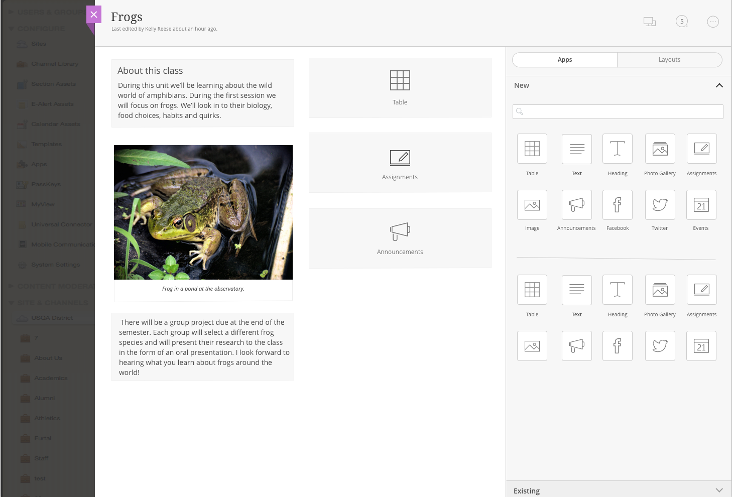
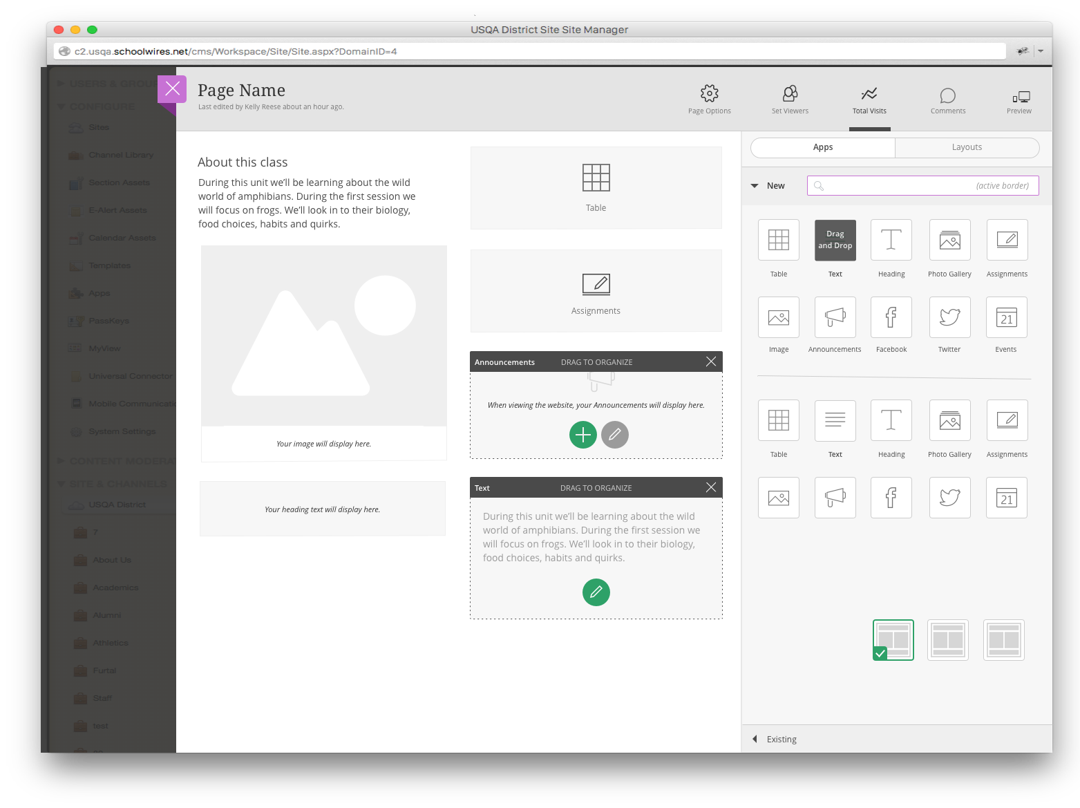
Helping users understand what to do with drag and drop by using smart interactions and accessibility considerations
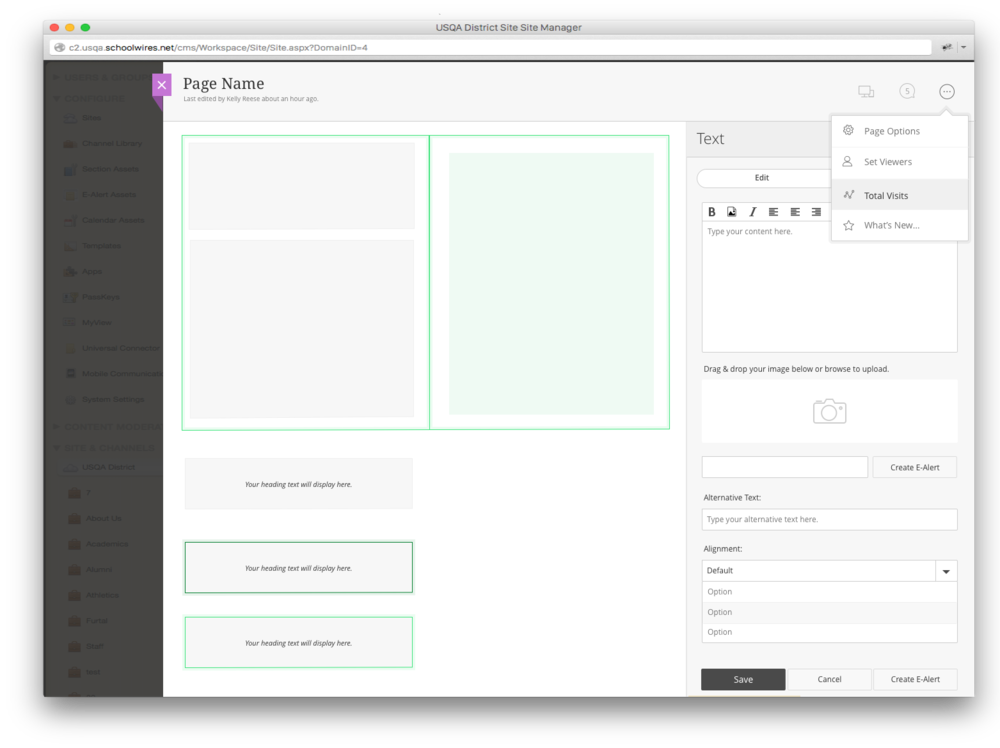
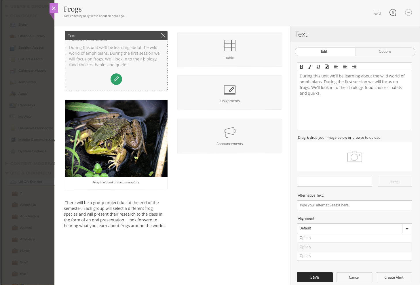
Helping to define interactions that made sense for how to layout content on a page. This tied directly to how users could interact with and edit their content in addition to previewing it. We tried to make the content authoring experience as close to the live preview as we could, but also had technical limitations with more complex modules which were treated differently.
We had some special considerations for mobile using responsive input patterns, but mostly tried to make it adaptive to context as possible.
Prototypes and Exploration
UI Aesthetic
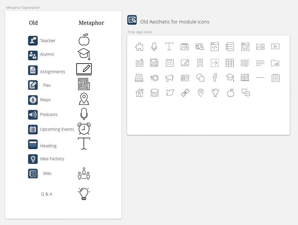
A new design system brought on by our acquisition was to be used in this feature. It was an interesting balance of introducing a new experience to a familiar audience at the same time as a new aesthetic was put forth.
Using the archetype from the new design language and incorporating it into the current experience without feeling clunky was a challenge. Our system had historical used a tree navigation hierarchy, with dynamic admin/content authoring areas. This new pattern was to slide in as an overlay, so we decided to go all in with the new language in the introduction rather than playing it safe. This is where pilot programs come in handy. We decided that if there was pushback or confusion, we could revisit. This made more sense than putting so much effort into our original idea of mixing two aesthetics and treading lightly. It also had a bigger impact and feel of “new”, while setting the stage for further aesthetic enhancements to come.
This also laid the groundwork for an overhaul of our system using the new design system plus custom additions to be added to the global system. This is where my work started deeply in our new design system definition and rollout (more to come on that soon).
Team
While this highlights my specific involvement on this project, it was a team effort. Other team contributors were: Kelly Reese, Sara Hardy, Wes Hulsizer, Heather Boyer, Craig Learn, Don George and Jason Coudriet.


