
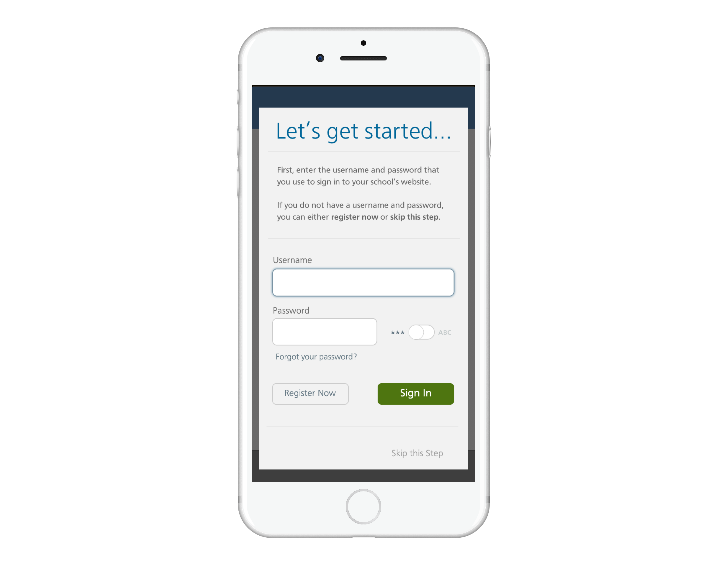
Original design I was tasked with updating.
School District
Mobile App
This project was one I was assigned to within our Product Design and Innovation's UX team at Schoolwires. Based on some feedback on our first version of our native app (we got better at soliciting this earlier in the process!), we were met with a few usability issues using the dashboard approach (see "before" image) for displaying notifications to record types. Because we had not yet instituted push notifications, the top issues were:
- The user had to search for content, or tap through a few apps with "new" item alerts to read through everything that may or may not be priority to them.
- User would also have to know what app a certain type of content belonged in if they were looking for a certain update. It was not always clear where it was posted.
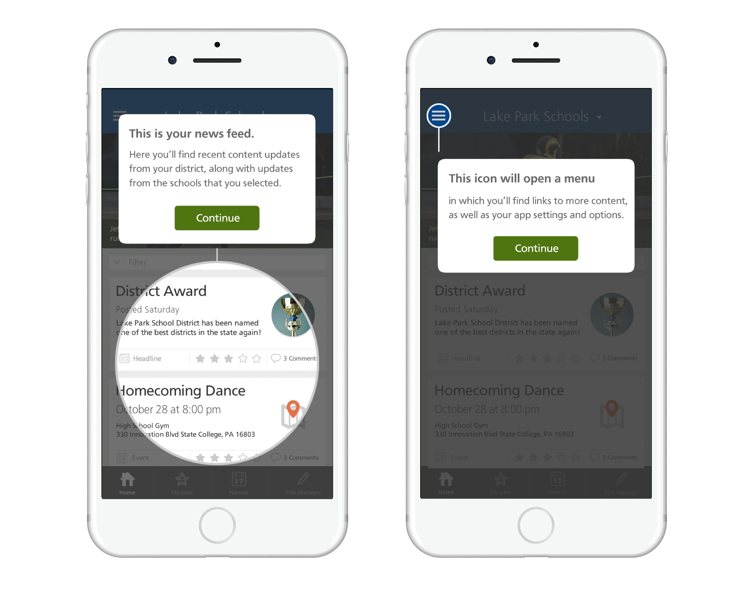
As the familiar UX pattern began to pop up on apps like Facebook, we decided an aggregated feed would solve most of the problems with the presentation of content.
Sketching some possibilities for the feed and each data type by pencil before I hit the screen.
I went to work sketching the feed and mapping the current data from our CMS to each card or record type and figured out what made sense in a summary view vs. the full view, along with transitions and how to present and interact with each type. I used Balsamiq to explain interaction, gestures to our team. After some iterations, our prototype was ready for stakeholder feedback. Since our CMS already had a familiar content model of "summary that opens up more detail" on the end user side, that helped that process move quickly.
Interactive design and gestures. Schoolwires/Blackboard rights 2013+
Pulling all of the record content into one feed meant we needed a better way to hide (yet still access) more administrative tools and filters. A school filter was placed above the feed, and we instituted a then-familiar off-canvas menu which allowed there to still be categorized content view settings.
I collaborated with others to get more input, then I got to work on the UI design in Sketch. After some iterations of that the designs were implemented and continued to receive upgrades such as full-width images in the feed and other usability enhancements on the front end in addition to the authoring tools (such as an auto-crop image uploader which pushed a smaller image to the feed view vs the detail view of a record).
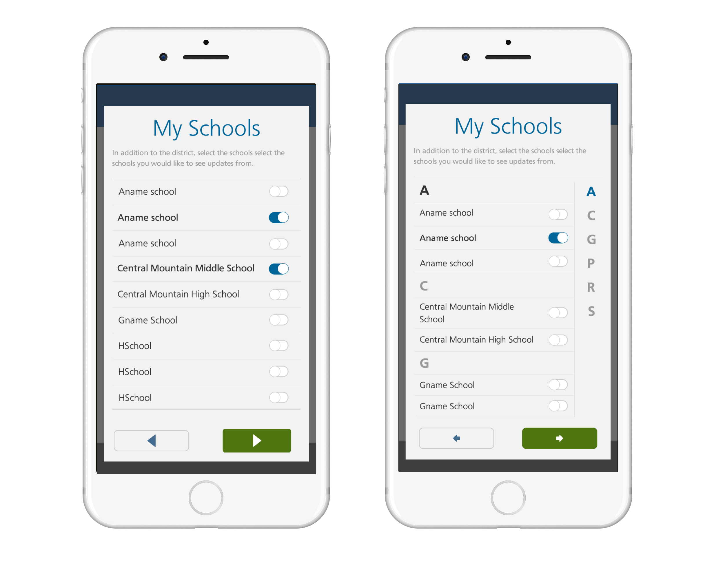
MVP design.
Animated Prototype
I created an animated prototype to help convey intent to our engineers. I did a lot of exploring of mobile prototyping tools. I tried out Miya, Origami, Adobe Edge Animate, and Invision.
Tour
For this part of the app, I worked from wireframes originally created by colleague Sara Hardy.

Copyright Blackboard 2013+
I used a very straightforward method to passing it along to our development team in a different time zone: A screencast through the wireframes and assets from a script I had written.
Copyright Blackboard 2013+
Copyright Blackboard 2013+